You have a logo. What you do not have is a usable file.
Maybe the designer disappeared years ago and all that survived is a 400-pixel JPG pulled off an old website. Maybe you generated something you liked in ChatGPT or Midjourney and now the printer has asked for "vector". Maybe you have a photo of a business card.
Then the print shop, the embroiderer or the sign maker says the same sentence everyone eventually hears: "Can you send this as a vector?"
This guide walks through the whole path, preparing the image, using AI to improve it (and the one mistake almost everybody makes here), tracing it free in your browser, and knowing the point at which no tool on earth will save the file and it has to be redrawn by hand.
First: why your image is not converting properly
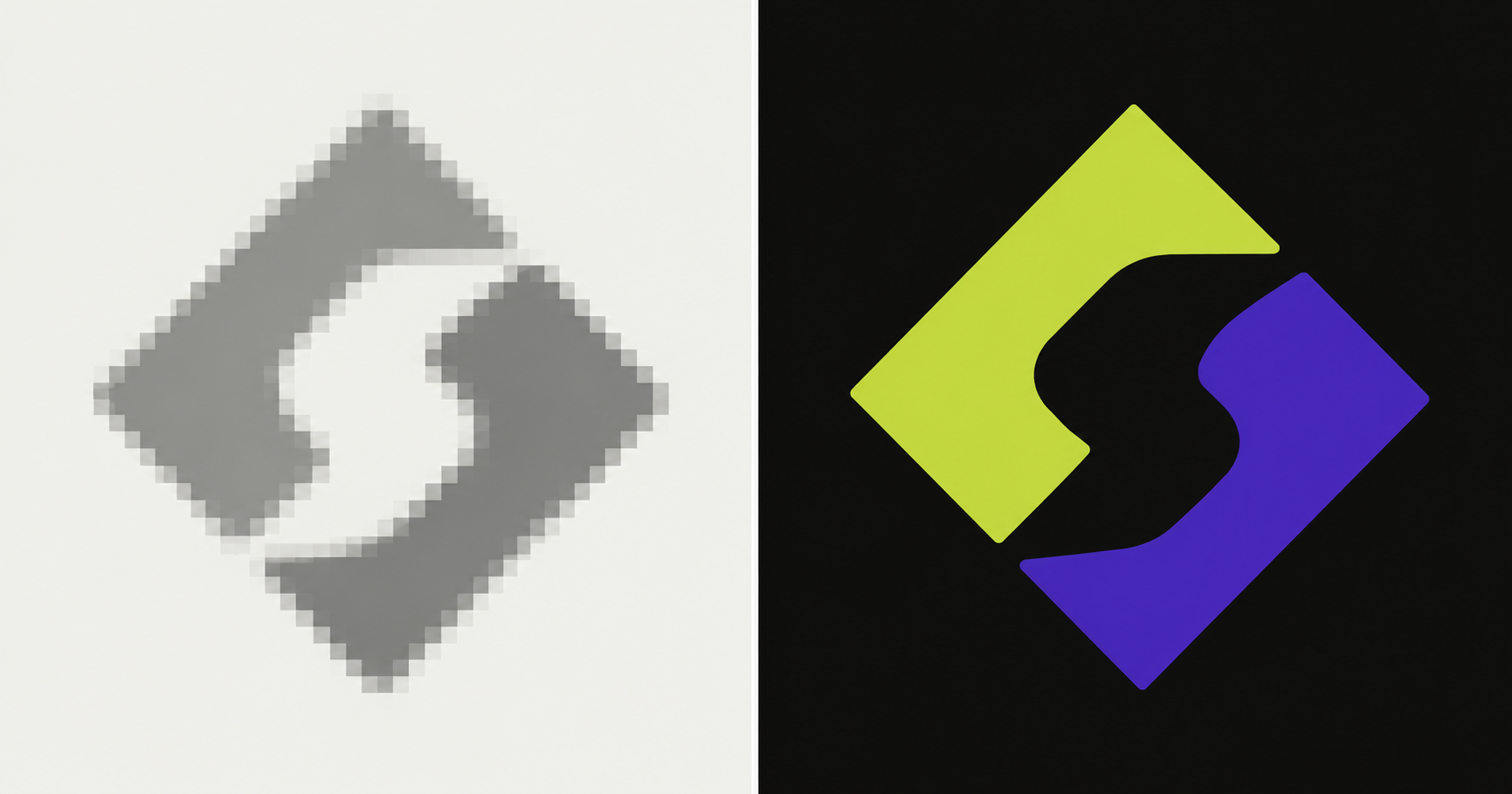
Auto-tracing software does not "understand" your logo. It looks at pixels, finds the boundaries where light meets dark, and lays paths along them. That is all it does.
So it struggles with exactly the things low-quality images are full of:
- Low resolution: below a certain size the tracer has to guess where an edge actually is, so corners round off and straight lines wobble
- JPG compression: those faint blocky squares around edges get traced as real shapes
- Anti-aliasing: the soft grey pixels that make edges look smooth on screen become jagged steps or bands of near-identical colour
- Photographs of logos: uneven lighting, shadows, perspective, paper texture
- Gradients and soft shadows: traced as dozens of stacked bands instead of a smooth blend
- Tiny text: the first thing to turn to mush
- Screenshots: usually the worst source of all
If your traced result looks lumpy, has hundreds of stray specks, or your company name has gone soft and unreadable, the tracer is not broken. It is doing its best with an image that never contained the information you are asking it to recover.
Step 1: Look for the original before doing anything else
This step takes five minutes and saves everything.
Ask your original designer, agency, printer or web developer for the source file: anything ending in .ai, .eps, .svg or a vector .pdf. Check old email attachments and any handover folder from when the brand was made.
If a vector already exists, you are finished. It scales to a billboard without losing a pixel.
Only when you are certain nothing survives should you continue.
Step 2: Start from the best possible copy
Before any tool touches it, find the biggest, cleanest version of the image you own. In order of preference:
- An original PDF, even a print-ready one, it may contain vector artwork already
- The largest PNG you have
- A high-resolution photo of printed artwork, a business card or signage shot in flat, even light
- A JPG from a website
- A screenshot (last resort)
Aim for at least 1000 pixels across, ideally 2000 or more. A crisp 2000px PNG will trace far better than anything you can do to a soft 400px one.
And use PNG rather than JPG where you can. Every time a JPG is saved it adds more compression noise, and that noise becomes fake detail in your vector.
Step 3: Use AI to improve the image, but understand what you are actually using
This is where most guides give advice that will quietly ruin your logo, so it is worth being precise.
There are two completely different kinds of AI image tool, and they are easy to confuse.
Faithful upscalers, safe
These add pixels by reconstructing detail that was already implied in the source. They do not invent. Letterforms stay the same letterforms, and the shape you get back is the shape you sent.
- Upscayl: free, open source, runs on your own computer (Windows, Mac, Linux). Good on clean edges and line art. The best free starting point.
- Topaz Gigapixel: paid desktop software, the standard for faithful enlargement.
- waifu2x: free and browser-based, very conservative, strong on line art.
- Photoshop's Super Resolution (or the older "Preserve Details 2.0"), faithful, unlike the newer generative option in the same app.
Use these, at 2× to 4×, and no more.
Generative AI, not safe for a real logo
These redraw the image using what they have learned images "should" look like. They produce something that looks impressive and is not your logo.
This includes ChatGPT, DALL·E, Midjourney, Gemini's image models, and the "creative" upscalers such as Magnific, Krea, Freepik's creative mode and Photoshop's Generative Upscale.
Here is the part that matters. If you upload your logo to ChatGPT and type "enhance this to 4K and make it vector-ready", it does not enlarge your logo. It generates a brand new image that resembles your logo. The architecture regenerates the entire picture rather than editing your pixels, so it can and does change:
- The exact curve of a letter
- Spacing between characters
- The thickness of a stroke
- Corner radii and small geometric details
- The spelling of your company name
That last one is not a joke. Text is the single weakest area for image models, they paint shapes that look like letters rather than writing letters, and independent benchmarks have documented them silently re-spelling words while producing something that still looks plausible.
For a photo of a landscape, none of this matters. For a brand mark, a subtly altered logo is worse than a blurry one, because nobody notices until it is printed on 500 shirts.
If you still want to try a chat model, treat the output strictly as a reference for redrawing, never as a deliverable, and use a prompt that pushes hard against invention:
Upscale this logo to a clean, high-resolution version. Preserve the exact shapes, proportions, letterforms and spelling with complete fidelity. Do not redraw, restyle, reshape or re-letter anything. Remove only compression artifacts, noise and blur. No creative reinterpretation, no new elements, no font substitution, no colour shift, no cropping.
Then compare it to the original letter by letter, at high zoom, before trusting a single pixel of it.
If your logo came from AI in the first place
AI-generated logos are unusually hard to vectorize, because they contain everything tracing hates: soft gradients, fine noise, inconsistent line weights, shapes that are almost symmetrical, circles that are not quite circles, and text that often is not real text.
The practical approach is to treat the AI image as a concept sketch rather than a finished logo. It shows the idea. Someone still has to build the actual artwork with true geometry and real type, which is exactly what the redraw service further down does.
If you are still generating, ask for vector-friendly output from the start: flat vector style, bold clean shapes, maximum three solid colours, no gradients, no shadows, plain white background.
Step 4: Clean the image up (free, five minutes)
A few small fixes make a large difference to trace quality. All of these are free in Photopea (browser, no install, works like Photoshop) or GIMP (desktop).
- Increase contrast: makes the boundary between logo and background unambiguous
- Reduce noise: removes the JPG artifacts that would otherwise become shapes
- Crop tightly: remove everything that is not the logo
- Straighten: if it is a photo or scan
- For a one-colour logo, apply a Threshold: this converts everything to pure black and white and strips the anti-aliased grey edge pixels. It is the single biggest improvement you can make when producing black and white vector art, and it is what makes vector graphic black and white output come out clean rather than grey and fuzzy.
- Clean or remove the background: a plain, even background traces far better than a busy one
Step 5: Trace it, free, in your browser
Now put the cleaned image through our free vectorizer.
It runs entirely inside your browser. Nothing is uploaded to a server, there is no sign-up, no watermark, no daily limit, and it works on PNG, JPG and WebP up to 10 MB.
Three things to get right:
Pick the right preset. Logo for flat solid-colour marks. Sketch / Line art for black and white drawings, signatures and stamps, it traces a single outline rather than chasing colour regions. Photo for complex or shaded images.
Raise the Speckle filter if you are seeing dozens of tiny stray shapes. It discards fragments below a size threshold.
Lower the Colour precision if flat areas have split into several near-identical shades. This merges them back together.
Turn on Remove white background if your logo sits on plain white, then export your SVG.
For a clean, flat, reasonably sized logo, this is genuinely all you need, and it costs nothing.
How this compares to Illustrator image trace and Vector Magic
The engine behind every auto-tracer is broadly the same idea: look at pixels, fit curves to the colour boundaries.
Adobe Illustrator image trace gives you the most control, with sliders for paths, corners and noise, and you can edit the anchor points afterwards. It also needs an Adobe subscription, and it tends to produce far more anchor points than a person would use, so the result usually needs simplifying.
Vector Magic and similar paid converters handle busy, full-colour sources well, though they also lean toward dense paths.
Our vectorizer is instant and free, needs no software or account, and never uploads your file anywhere, which matters if the artwork is confidential.
All of them, including any AI SVG generator you may have seen advertised, share the same ceiling. They reproduce what the pixels suggest. None of them understand that a shape was meant to be a perfect circle, or that a word was set in a particular typeface. For a logo that has to be exactly right, only a human redraw gives you true geometry and real type.
Step 6: Judge the result honestly
Zoom in to 300% or more and look for:
- Wobbly curves where they should be smooth
- Corners that have gone soft and rounded
- Text that is not quite the shape of the original letters
- Stray specks around the artwork
- Bands of slightly different colour inside what should be one flat shape
- Circles that are not perfectly round
If it looks clean, you are done. Use it.
If any of that is present, no amount of extra tracing will fix it, because the problem is upstream in the pixels.
Step 7: When it has to be right, have it redrawn by hand
There is a limit that no auto-tracer, no AI upscaler and no setting can cross: a tracer can only follow what is in the image. It cannot rebuild what was never there.
A designer can. Rather than following blurry pixels, they rebuild the logo from scratch, true circles that are actually circular, straight lines that are straight, correct symmetry, and the real typeface identified and re-set as live text rather than traced letter shapes.
That is what our manual vector redraw is for. Send whatever you have, however bad, and a professional designer rebuilds it by hand into a print-ready vector:
- Basic, $15. Simple logo, flat colours up to 3, wordmark or simple shape. SVG + PDF + EPS + PNG, 2 revisions, 48-hour delivery.
- Standard, $29. Detailed logo, up to 8 colours, gradients and multiple elements. All formats plus the source file, 3 revisions, 48-hour delivery.
- Premium, $59. Complex artwork, mascots and illustrations, unlimited colours and fine detail. All formats plus editable source, unlimited revisions.
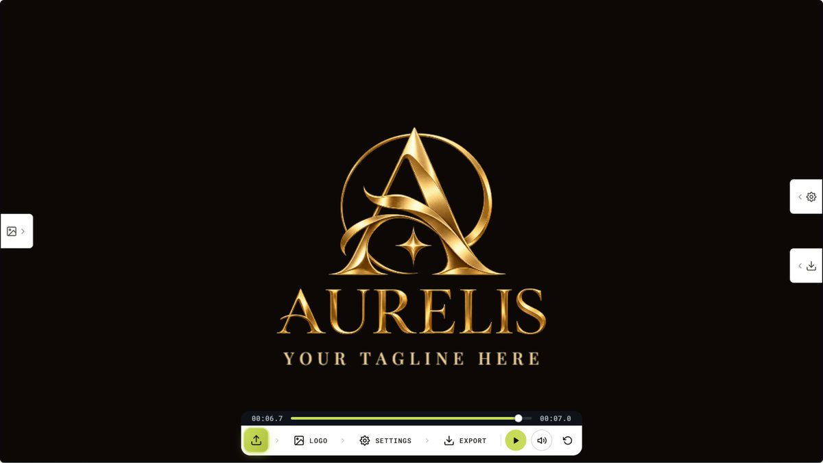
There is a short time-lapse on the page showing a designer rebuilding a logo path by path, which also shows which kind of artwork falls into which package, so you can pick the right tier before you order.
Go straight to a redraw, without bothering to trace, if: your only file is under about 300 pixels, the logo contains text you need to be exactly right, it is an AI-generated image with gradients or invented lettering, or it is destined for embroidery, vinyl, laser cutting or large-format print, production methods that are far less forgiving than a screen.
Bitmap or vector image? A quick explainer
Before the formats, the distinction that causes most of the confusion.
A bitmap image, also called raster, is a grid of coloured pixels. PNG, JPG, WebP, GIF and BMP are all bitmaps. Enlarge one and you are simply enlarging the pixels, so it goes soft and blocky. This is why a PNG file is never a vector file, no matter how large it is.
A vector image stores shapes instead of pixels: points, curves and fills described mathematically. That is what makes it resizable to any dimension with no loss of quality, and still editable afterwards. It is why print shops, sign makers, embroiderers and laser cutters all ask for vector artwork rather than the PNG you already have.
What is a vector file format, and which do you need?
The common vector file format types, and what each is actually for:
- SVG: websites, apps, and cutting machines like Cricut, Silhouette and most laser software
- PDF: the standard for commercial printers
- EPS: sign shops, screen printers and embroidery digitising software
- AI: the editable master file for future design work
- CDR: CorelDRAW, common with sign makers and engravers
One caution worth knowing: a PDF is a container, not a guarantee. A scanned page saved as a PDF is still just a photograph inside a wrapper. The quick test for any file: zoom in hard. If edges stay razor sharp at 1600%, it is vector. If they dissolve into soft squares, it is not.
A clean SVG opens in Illustrator, Inkscape, CorelDRAW, Cricut Design Space and Silhouette Studio, so the same file covers t shirt vector printing, stickers, vinyl and engraving. For merch and production work, raise the Speckle filter before exporting, since stray fragments that are invisible on screen become real problems on a cutting machine.
Embroidery is its own case, machines need a stitch file such as DST or PES, which a digitiser produces from clean vector artwork. Good vector is the input, not the final deliverable.
The short version
- Hunt for the original vector first, it may already exist
- Start from the largest, cleanest copy you own
- Upscale only with faithful tools like Upscayl, never with ChatGPT or a creative upscaler, and never trust the output without checking it letter by letter
- Clean up contrast, noise and background free in Photopea or GIMP
- Trace it free in your browser with our vectorizer
- Inspect at 300% zoom and be honest about what you see
- If it has to be exactly right, have it redrawn by hand from $15
Auto-tracing is genuinely excellent for clean, flat, decent-sized logos, and it costs you nothing to find out which category yours falls into. But when the source is a small JPG, a photo or an AI-generated image, the honest answer is that the artwork needs rebuilding rather than converting, and it is better to learn that now than after the shirts are printed.